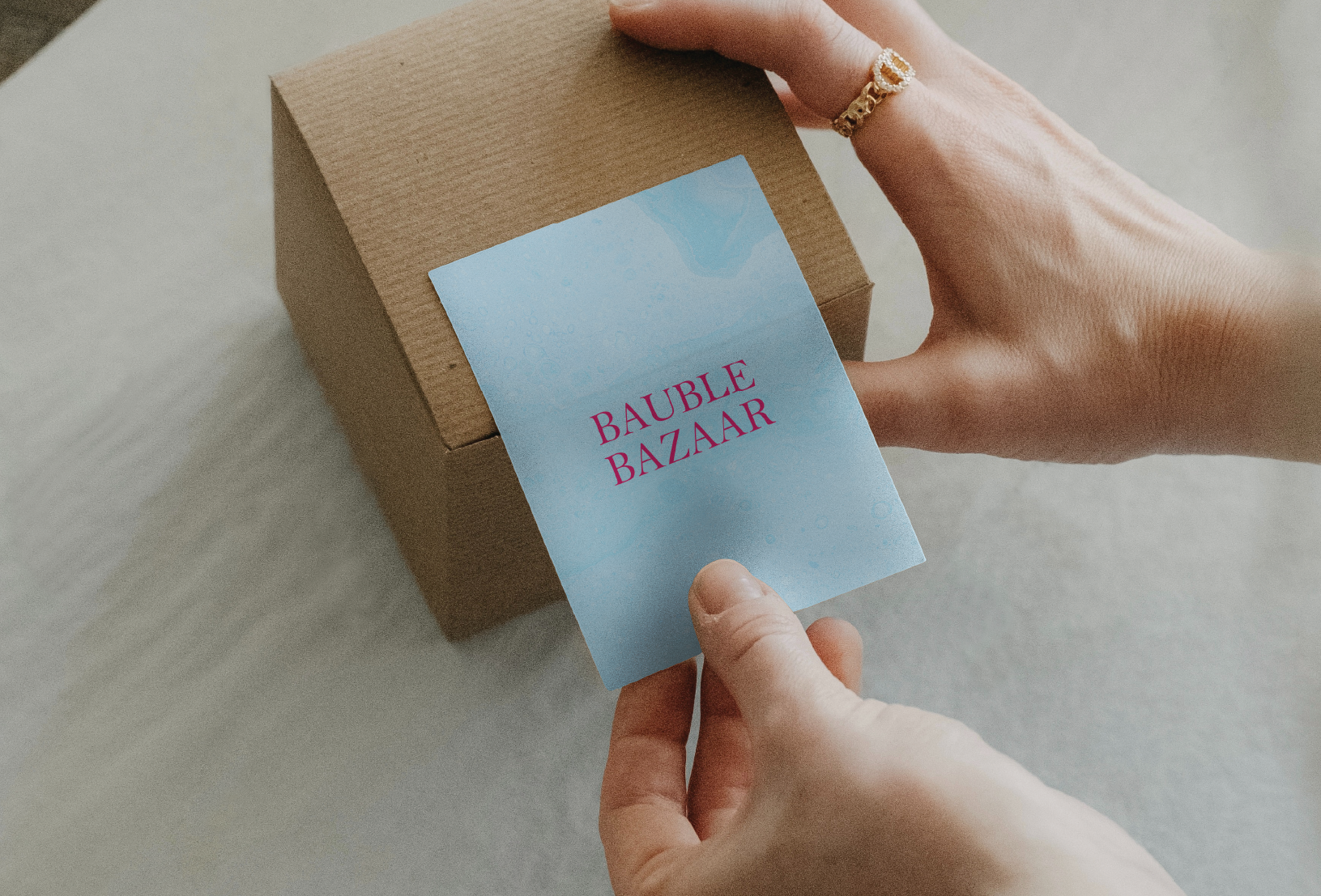
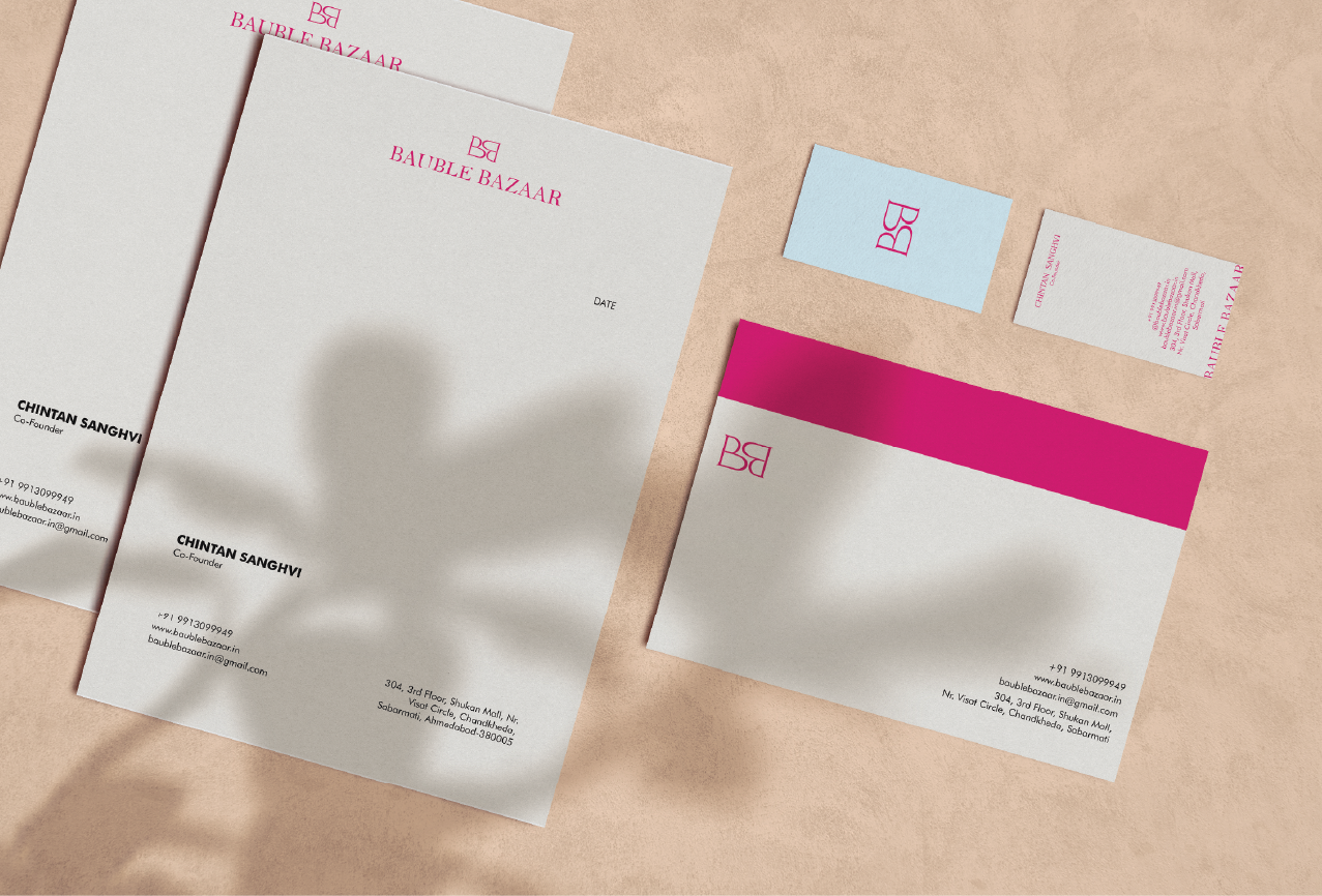
These are logo variations that play a role in a brand’s visual identity and brand recall value. They position a brand as distinct and recognizable across all touchpoints while making it look cohesive and established.
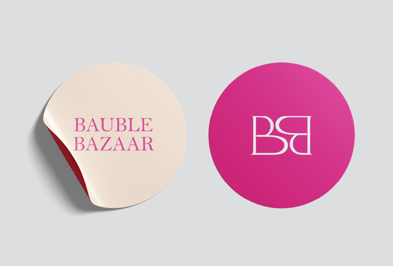
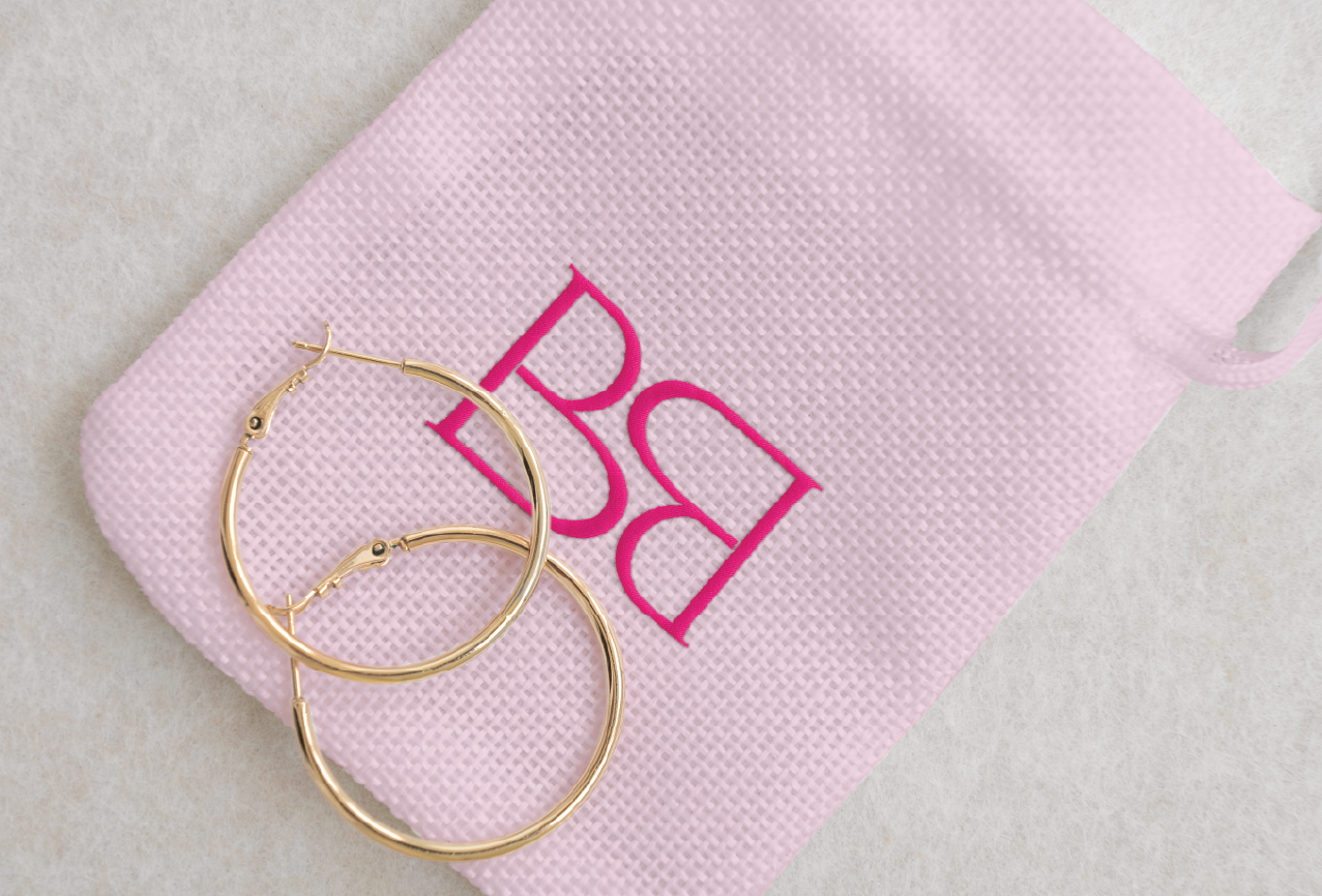
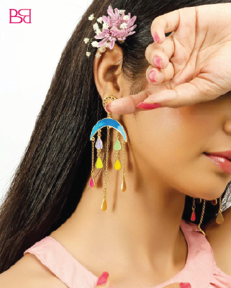
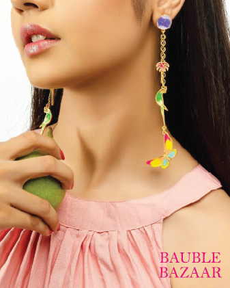
Bauble Bazaar is more than just a jewellery brand; it’s a haven for those who celebrate individuality. They celebrate elegance, craftsmanship, and timeless beauty through bold bracelets that shout confidence and delicate necklaces that whisper elegance.
Their graceful handcrafted pieces are a perfect accessory to complement a special occasion or just to wear as a daily reminder of your unique style. Their customizable options let you create jewellery that is not just worn, but also cherished by you.
While re-branding their brand identity, we wanted to tell a story of love, of individuality, and milestones. The re-branding for them is meant to reflect refined luxury with a modern sensibility and the divinity of their jewellery pieces.
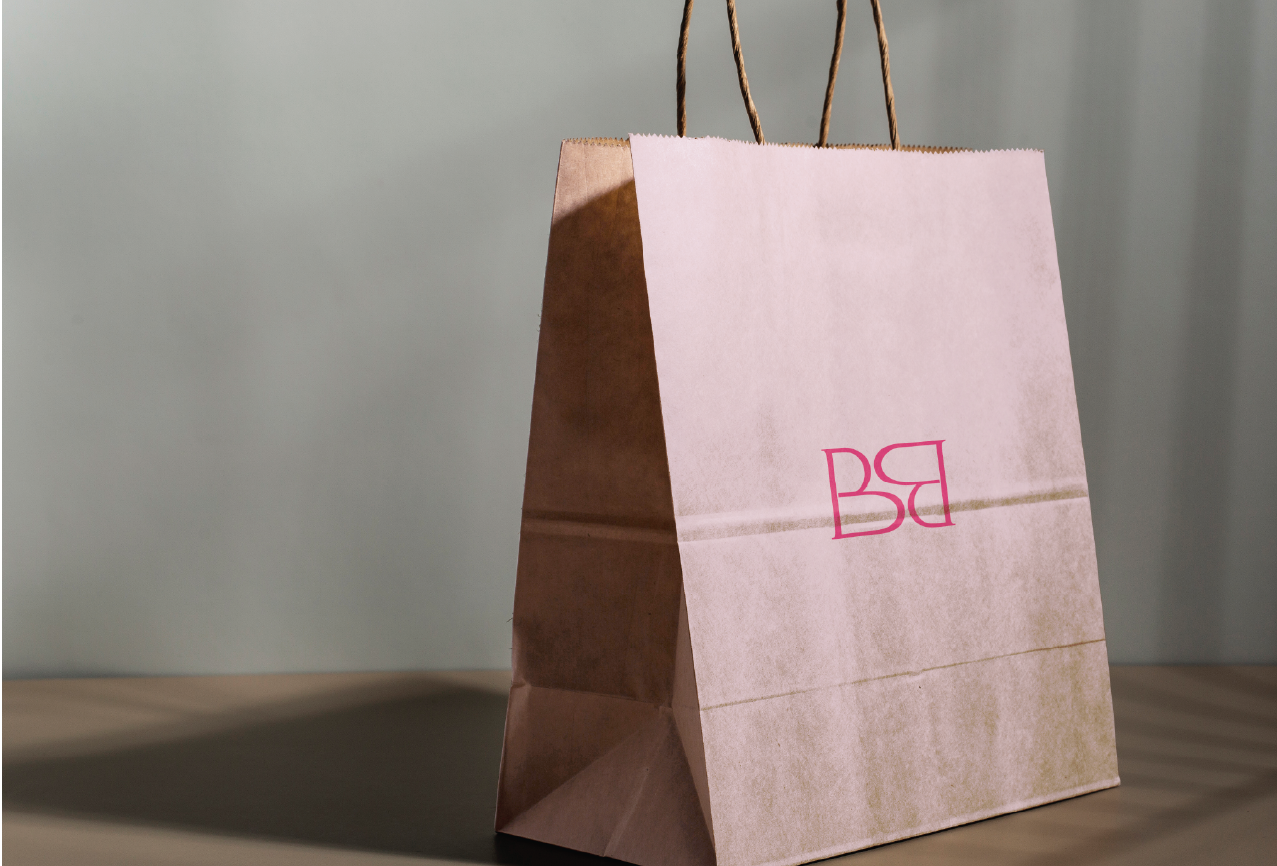
The B+B stands for Bauble Bazaar. The central element is a unique interplay of two mirrored "B"s, forming an abstract shape between them.
This intricate design symbolizes the artistry and individuality that define Bauble Bazaar's jewelry. The bold and heavy lines of the logo create a strong visual impact, ensuring high recognizability and recall value.
The overall aesthetic of the logo conveys a sense of allure and magnificence, aligning perfectly with the brand's commitment to providing exquisite, handcrafted jewelry.
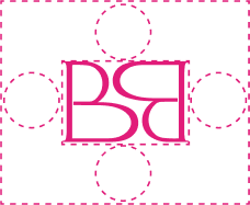
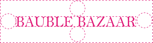
Allowing ample space around the Logo and Wordmark is essential for a clean and uncluttered appearance. This enhances their visibility and reinforces the brand’s identity.


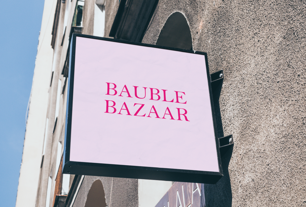
These are logo variations that play a role in a brand’s visual identity and brand recall value. They position a brand as distinct and recognizable across all touchpoints while making it look cohesive and established.
Taviraj is a serif typeface known for its wide structure that promotes readability and legibility. The font’s looped typeface makes it a great choice for a primary font to be used on several platforms.
Futura is a geometric sans serif typeface known for its clean and modern aesthetic. The font’s simple and sleek style makes it a great choice for a secondary font to complement a primary one.
Lorem ipsum dolor sit amet, consectetuer adipiscing elit, sed diam nonummy nibh euismod tincidunt ut laoreet dolore magna aliquam erat volutpataoreet dolore magna aliquam erat volutpat.aoreet dolore magna aliquam erat volutpat..
BUY NOWPrimary font (used as title)
Secondary font (used as sub-title)
Secondary font (used as body-copy)
Secondary font (used as button)
To establish a brand’s visual identity, we conduct thorough research on its industry and target audience. Based on this research, we craft some social media post mockups that demonstrate the ideal logo placement for the brand for maximum visibility and effectiveness. Positioning the logo in this layout ensures a creative flow and consistency across the brand’s social media presence. This approach enhances both the overall brand value and user experience.