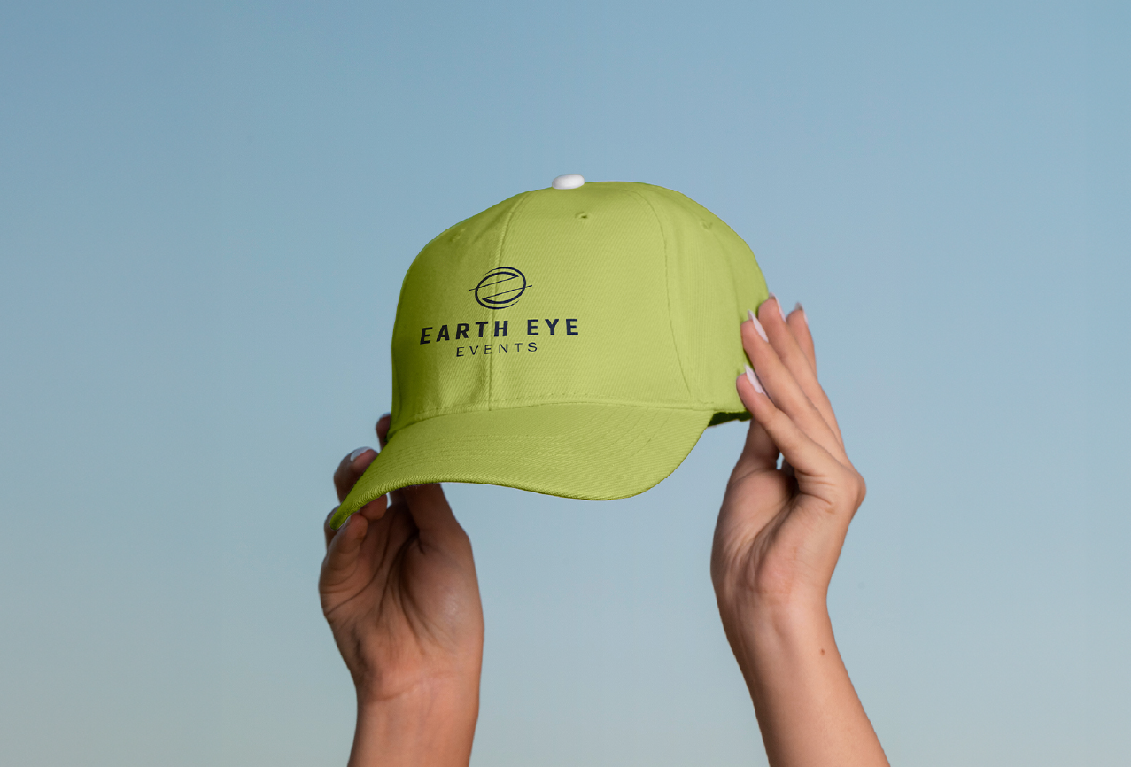
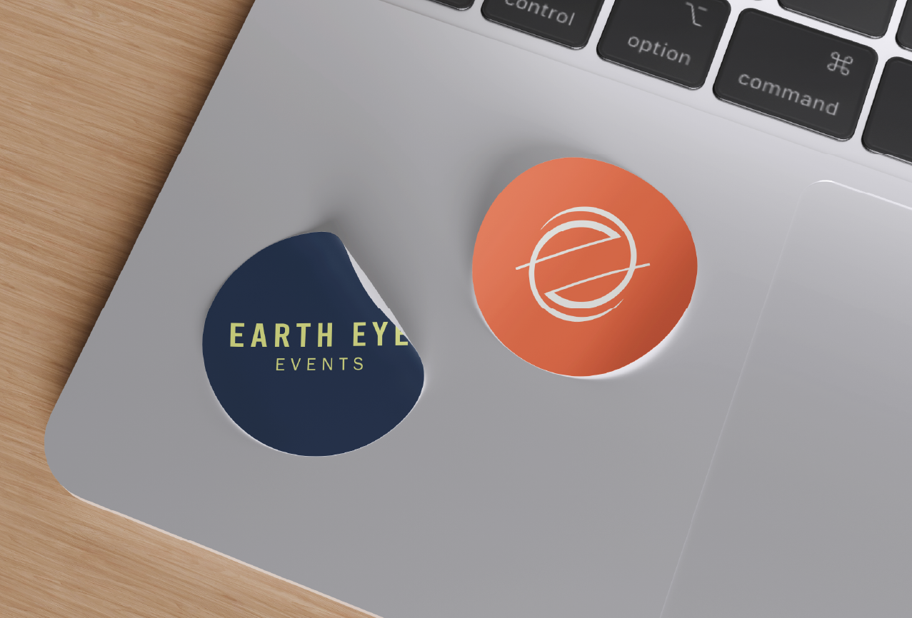
These are logo variations that play a role in a brand’s visual identity and brand recall value. They position a brand as distinct and recognizable across all touchpoints while making it look cohesive and established.
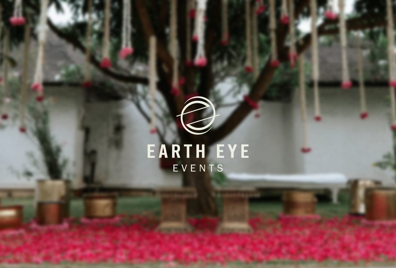
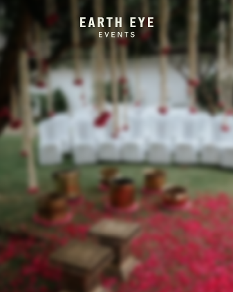
Earth Eye Events is a pioneering event planning and management company curating unforgettable experiences. Be it intimate gatherings or large-scale celebrations, birthdays, wedding ceremonies, or corporate parties, they craft events that leave a lasting impression.
Their keen eye for detail and passion for creativity give way to beautiful moments and precious memories. They combine sophistication and contemporary style to cater to diverse audiences and events. Their events are refined and personalised at the same time, making them feel exclusive but also welcoming.
This is the quality we wanted to bring out in their brand identity. With a sophisticated and elegant logo and a fun colour palette, we tried to invoke the same feelings of luxury and warmth that you get with Earth Eye Events planning an event for you.
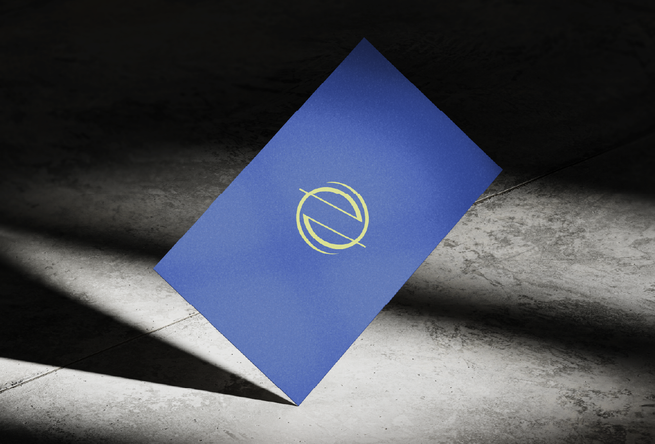
This circular form also subtly resembles a human eye, reflecting the company's keen attention to detail and focus on creating visually stunning events.


The Earth Eye Events logo is a minimalist masterpiece. Two stylized lowercase "e"s, crafted with a dynamic interplay of thick and thin strokes, interlock to form a perfect circle symbolizing the Earth.
The Earth Eye Events logo is a minimalist masterpiece. Two lowercase ‘e’s, crafted with a dynamic interplay of thick and thin strokes, interlock to form a perfect circle symbolizing the Earth.
This circular form also subtly resembles a human eye, reflecting the company's keen attention to detail and focus on creating visually stunning events.


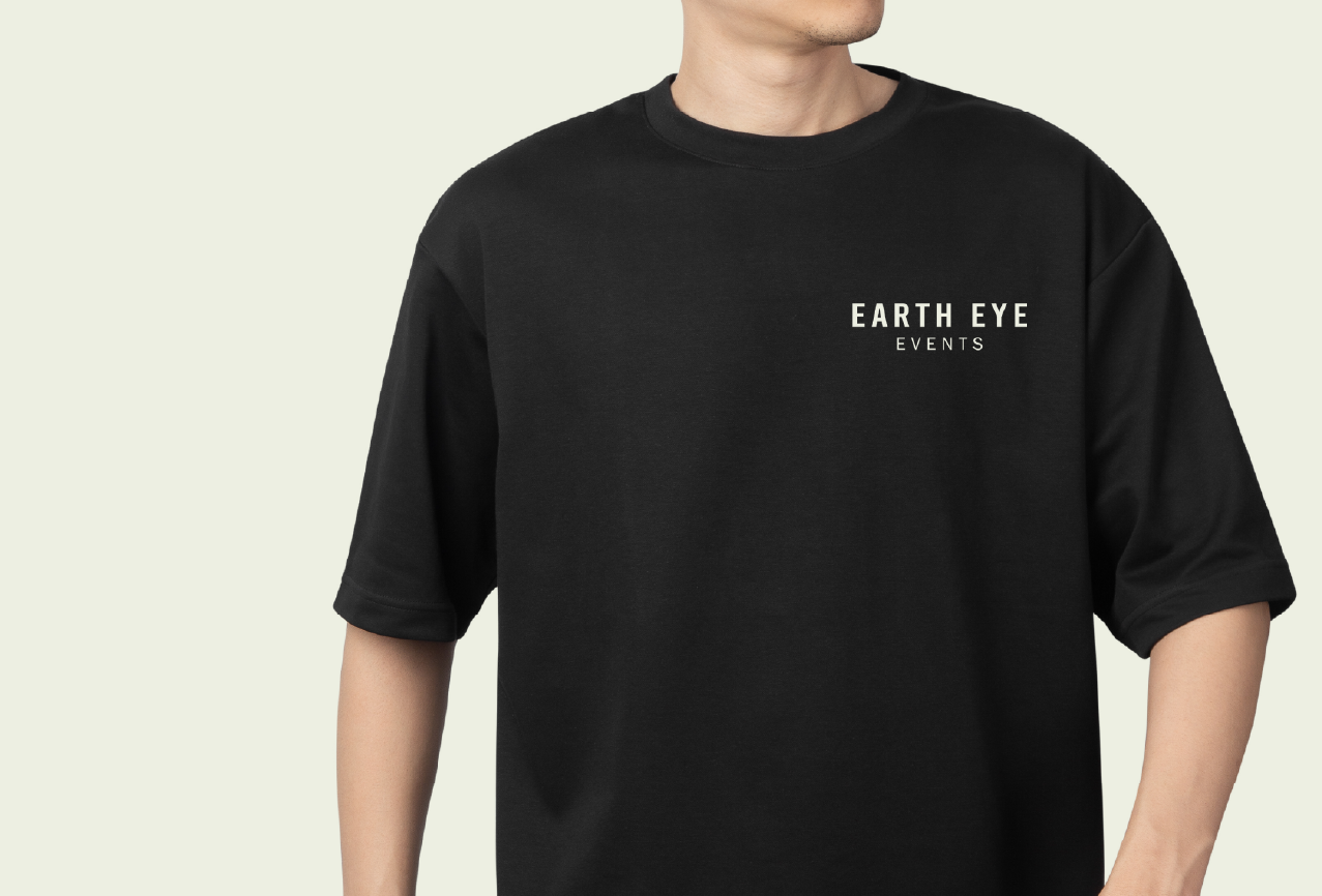
Allowing ample space around the Logo and Wordmark is essential for a clean and uncluttered appearance. This enhances their visibility and reinforces the brand’s identity.
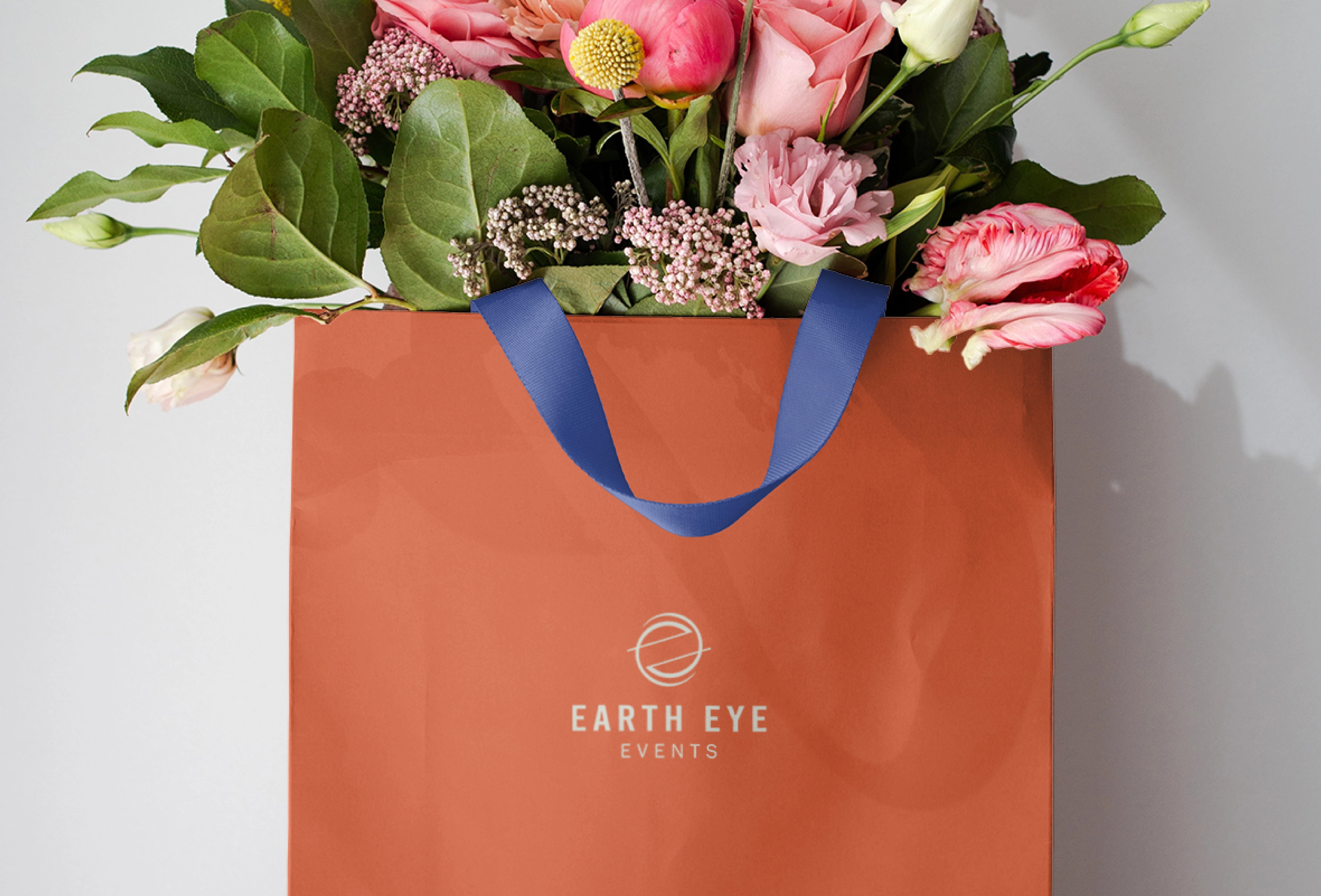


These are logo variations that play a role in a brand’s visual identity and brand recall value. They position a brand as distinct and recognizable across all touchpoints while making it look cohesive and established.
Fira Sans is a modern and versatile typeface that balances readability with a sleek, contemporary aesthetic. These qualities make the font a perfect choice for visual designs and an elegant look.
Outfit is a sans serif font known for its sleek and geometric visuals. This makes the font a go-to choice for a contemporary and balanced visual style.
To establish a brand’s visual identity, we conduct thorough research on its industry and target audience. Based on this research, we craft some social media post mockups that demonstrate the ideal logo placement for the brand for maximum visibility and effectiveness. Positioning the logo in this layout ensures a creative flow and consistency across the brand’s social media presence. This approach enhances both the overall brand value and user experience.