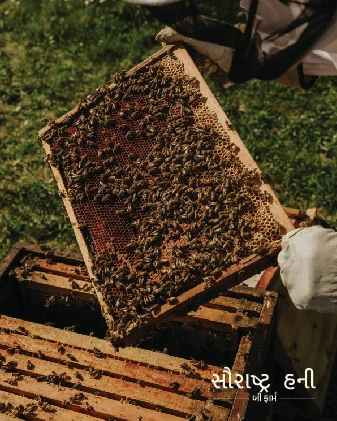
Saurashta Honey Bee Farm is a renowned manufacturer and wholesaler of Honey Bee Wax, Multi Flora Honey, and Ajwain Flora Organic Raw Honey. Rooted in sustainable beekeeping practices, they believe in the power of nature’s golden gift, i.e., pure honey harvested with care and authenticity.
Saurashtra Honey has been a pioneer in nurturing thriving bee colonies and providing premium honey and bee-derived products to consumers who value integrity and environmental stewardship. Their work embodies a commitment to quality as well as community.
While creating the brand identity for Saurashtra Honey, we drew inspiration from the harmonious relationship between bees and the natural world. We tried to create a warm and elegant logo that plays with the elemental tones of earth, honey, and nature.
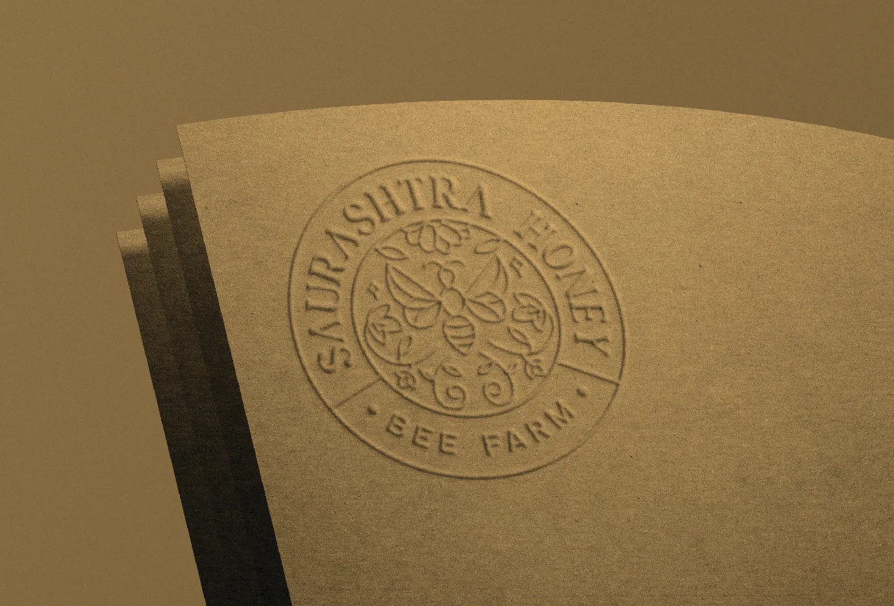
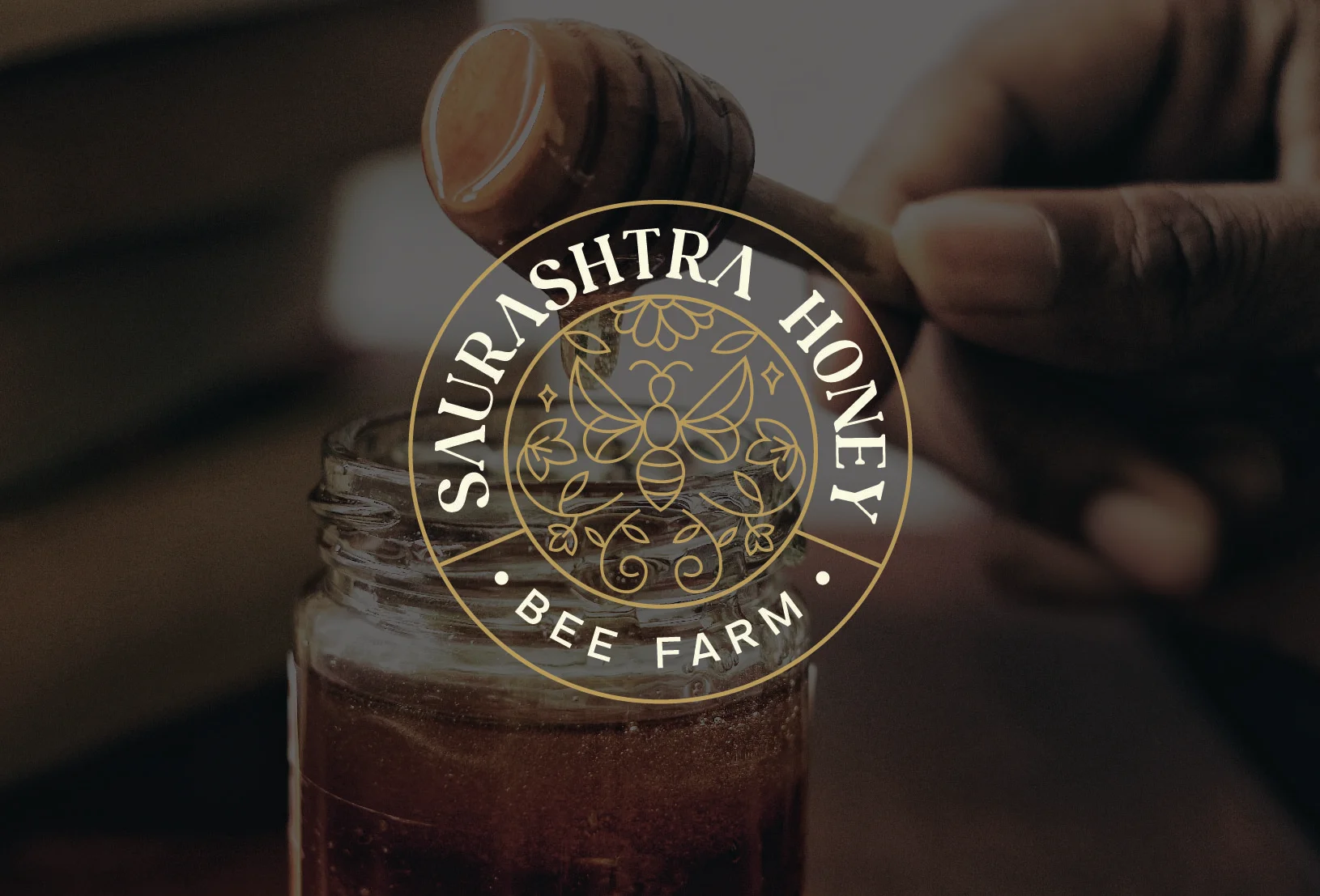
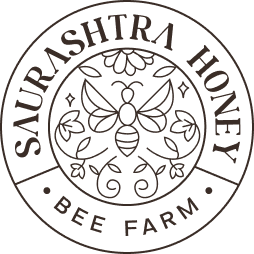
The logo for Saurashtra Honey is a celebration of nature’s golden gift, with the bee at the centre symbolizing industriousness and harmony with nature. The branching wave below represents the diverse flora contributing to the honey’s unique flavour. Tiny stars and leaves accentuate a touch of sophistication and organic purity, invoking a sense of premium quality and celestial sweetness.
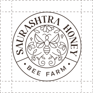
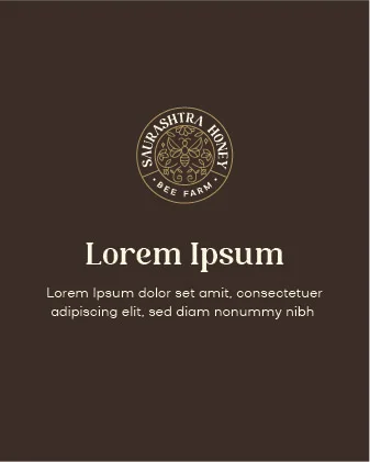
Allowing ample space around the Logo and Wordmark is essential for a clean and uncluttered appearance. This enhances their visibility and reinforces the brand’s identity.
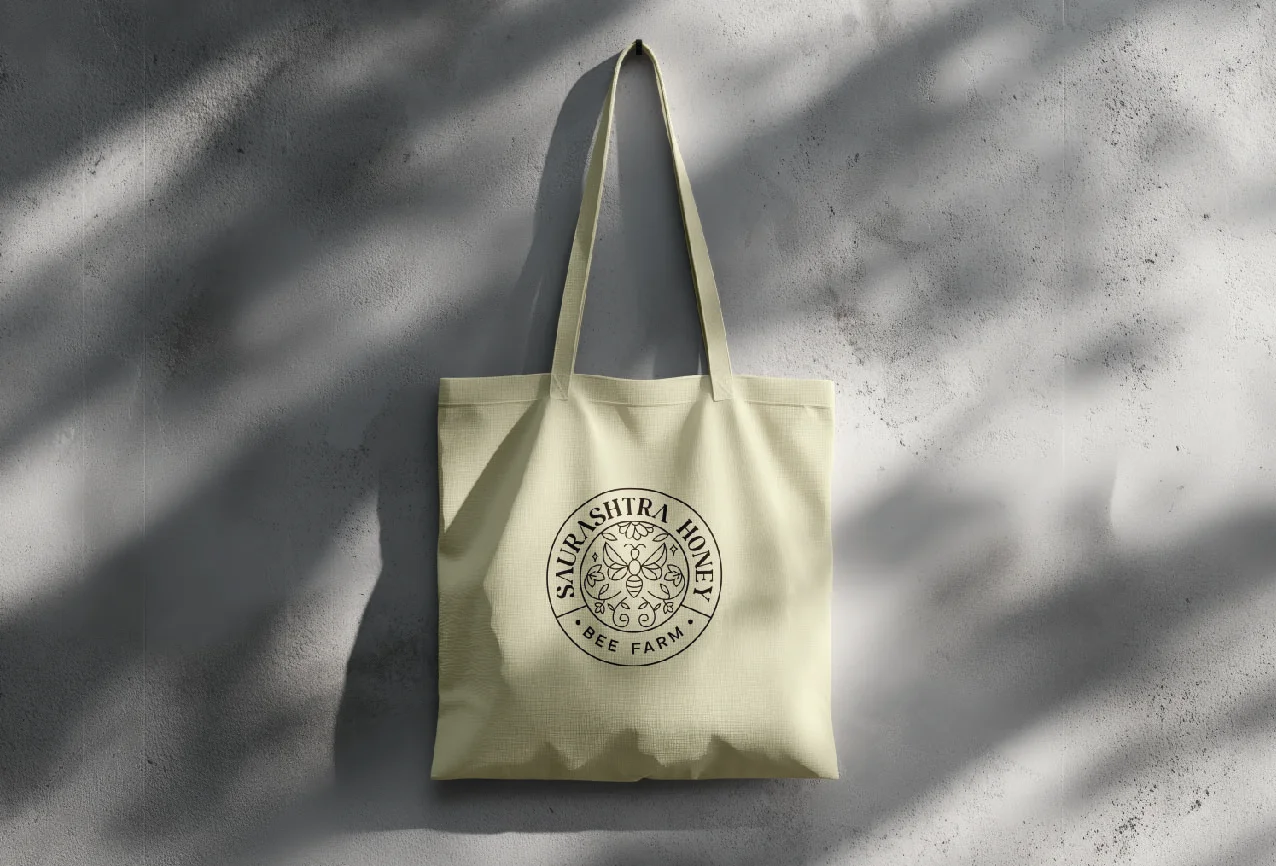


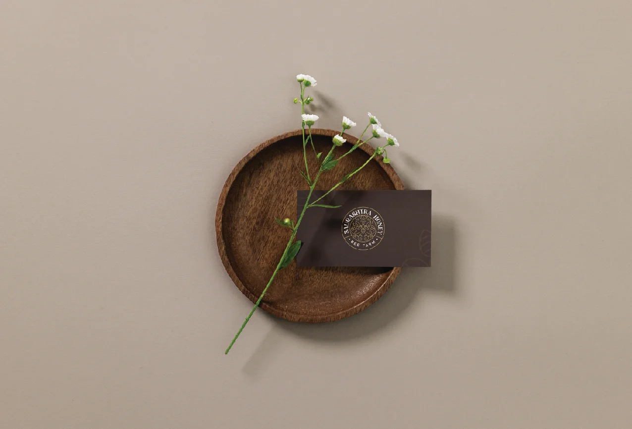
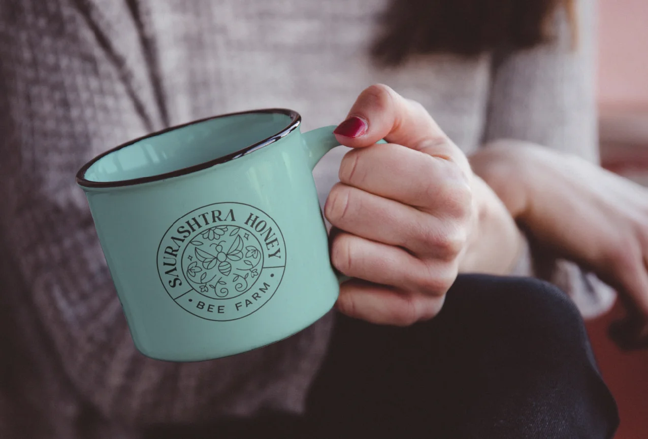
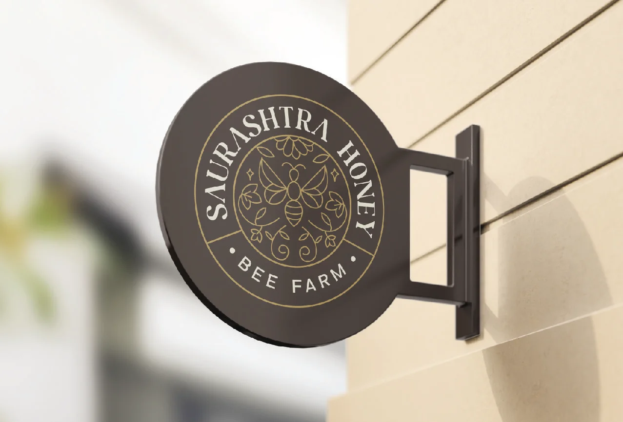
These are logo variations that play a role in a brand’s visual identity and brand recall value. They position a brand as distinct and recognizable across all touchpoints while making it look cohesive and established.
Duhai is a modern serif font that exudes charm and a sense of luxury. Its elegant typeface allows it to be a perfect choice for diverse designs and logos.
Aceh is a geometric sans serif font known for its clean, simple lines and modern look. These qualities and the font’s sharp and soft shapes allow it to pair well with a primary font.
When using the Icon and Logotype, it’s important to allow enough space around them. For an icon, the clear space should be half of
When using the Icon and Logotype, it’s important to allow enough space around them. For an icon, the clear space should be half of
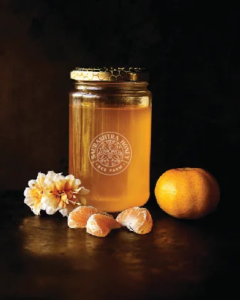
To establish a brand’s visual identity, we conduct thorough research on its industry and target audience. Based on this research, we craft some social media post mockups that demonstrate the ideal logo placement for the brand for maximum visibility and effectiveness. Positioning the logo in this layout ensures a creative flow and consistency across the brand’s social media presence. This approach enhances both the overall brand value and user experience.